• Jan. 23, 2023, 9:17 p.m.

    Misago's default page headers are pretty blant. Depending on page those are either single text of heading with a vertical line below it, or some extra text description under it. They only get more interesting on thread pages and user profiles. But even then the general theme of black text on white background with single horizontal line beneath it remains unchanged.

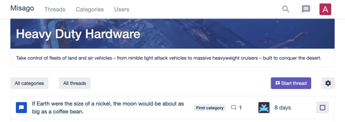
    This is done on purpose. Those basic styles mean there's little in a way for those seeking to customize them. And there is rich markup beneath that enables some very good results. Just take a look at this collage of three versions of same header:

    headers.png

    Note: This guide assumes that you already know how to use "Themes" feature to extend Misago's styles with custom CSS and image. If you don't know how to do this, see this guide first.

    Enabling header on forum index

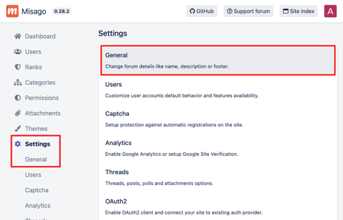
    By default there's no header on forum index, but you can set one yourself using the controls in admin panel. Sign in to you forum's admin panel. Next, go to "Settings" and then "General":

    headers-settings.png

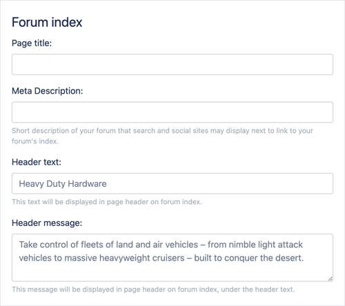
    Find the "Forum index" section:

    headers-index-settings.png

    To cause the header to appear on forum index, you have to fill in the "Header text" field. "Header message" is optional, but I've filled it in too to cause it too appear as well. This will make the HTML for page header contain both text and message sections that can be customized later.

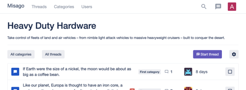
    Here's our forum's header now:

    header-index-blank.png

    Header's markup

    While headers appear to be very simple, their markup is considerably rich. We can retrieve it by using our browser's dev tools:

    <div class="container page-header-container">
      <div class="page-header page-header-forum-index">
        <div class="page-header-bg-image">
          <div class="page-header-bg-overlay">
            <div class="page-header-image"></div>
            <div class="page-header-banner page-header-banner-forum-index">
              <div class="page-header-banner-bg-image">
                <div class="page-header-banner-bg-overlay">
                  <h1>Heavy Duty Hardware</h1>
                </div>
              </div>
            </div>
            <div class="page-header-details">
              <div class="page-header-message">
                <p>Take control of fleets of land and air vehicles – from nimble light attack vehicles to massive heavyweight cruisers – built to conquer the desert.</p>
              </div>
            </div>
          </div>
        </div>
      </div>
    </div>
    

    Let's unwrap it, layer by layer:

    page-header-container is main div that contains the header and gives it its max width, as well as horizontal margins to always keep it far from windows or display's edges. The page-header-container class is shared by all page headers.

    page-header page-header-forum-index is top-level div of page header and source of it's margins and bottom border. page-header class is universal to all pages on Misago but page-header-forum-index is unique to the forum index. Categories, threads, profiles and other pages have their own second class enabling separate headers for each of them.

    page-header-bg-image is a div that can be used to set background image of entire header.

    page-header-bg-overlay is a div that can be used to set an overlay over the background image to improve header's text readability.

    page-header-image is an extra div above header's contents that can be customized with CSS to display an image above header's contents instead of behind them.

    page-header-banner page-header-banner-forum-index is a div that contains the "banner" part of header. This is the part of header that contains h1 element with page's title as well as its breadcrumbs on thread pages. page-header-banner class is universal to all pages on Misago, but page-header-banner-forum-index is unique to the forum index. Likewise other pages have classes specific to them.

    page-header-banner-bg-image is a div that can be used to set background image of banner part of header.

    page-header-banner-bg-overlay is a div that can be used to set an overlay over the banner image to improve header's text readability.

    page-header-details is a div that contains additional information about the page. On forum index it has forum's welcome message. On categories pages it displays categories descriptions. On threads and user profiles it holds information about those.

    page-header-message is a div that holds text with page's message or description. Its used by some headers and lets you customize style of message text's without ruining page details on pages that don't have it.

    Some pages enable for customization of the page-header and page-header-banner classes. Categories and threads in those categories default to -category-threads suffix which can be replaced by setting custom "CSS Class" for selected categories. Its same with users profiles that default to -profile which can be replaced with "CSS class" of their user rank.

    header-index-blank.png

    PNG, 112.2 KB, uploaded by rafalp on Jan. 23, 2023.

    headers-index-settings.png

    PNG, 104.9 KB, uploaded by rafalp on Jan. 23, 2023.

    headers-settings.png

    PNG, 170.1 KB, uploaded by rafalp on Jan. 23, 2023.

    headers.png

    PNG, 568.4 KB, uploaded by rafalp on Jan. 23, 2023.

  • Jan. 23, 2023, 10:54 p.m.

    Create new theme for your customization. We'll start with simplest customization first and will display custom image above the header's text. We will use the page-header-image style for this.

    I've picked image to use and created this style for my theme:

    .page-header-forum-index .page-header-image {
      background-color: #101E38;
      background-image: url('hw-bg.jpeg');
      background-size: cover;
      background-position: center center;
      border-radius: 4px;
    
      height: 128px;
      margin-top: 24px;
    }
    

    .page-header-forum-index .page-header-image CSS selector picks empty header image div on forum index. Height css sets image's height, and margin top adds 24px to default 8px of top spacing, making it double the height of standard spacer used by Misago which is 16px.

    Final result looks like this:

    header-demo-1.png

    header-demo-1.png

    PNG, 699.1 KB, uploaded by rafalp on Jan. 23, 2023.

  • Jan. 23, 2023, 11:14 p.m.

    This time I will actually customize the banner section of header, but also make the header stick to the navbar. Like before I've created new theme and already uploaded an image for it.

    Commented style for header looks like this:

    .page-header-forum-index {
      /* Remove the top margin of page header */
      margin-top: 0;
    
      /* Remove any border from header */
      border: 0;
    }
    
    .page-header-banner-forum-index .page-header-banner-bg-image {
      /* Set background color and image for banner part */
      background-color: #101E38;
      background-image: url('hw-bg.jpeg');
      background-size: cover;
      background-position: center center;
    }
    
    .page-header-banner-forum-index .page-header-banner-bg-overlay {
      /* Set paddings on banner overlay to match rest of the theme */
      padding: 24px 16px;
    
      /* Set background for banner overlay: semi-transparent dark blue */
      background-color: rgba(42, 64, 135, 0.7);
    
      /* Make color white and give it text shadow to further improve its clarity */
      color: #fff;
      text-shadow: 0 0 3px #101E38;
    }
    
    .page-header-forum-index .page-header-details {
      /* Add padding to page details */
      padding: 16px;
    
      /* And give it a border to make it visibly belong to the header */
      border: 1px solid #ebecf0;
      border-top 0;
      border-radius: 0 0 4px 4px;
    }
    
    .page-header-forum-index .page-header-message>*:last-child {
      /* Remove bottom margin of last child in page's description */
      margin-bottom: 0;
    }
    

    Here's final result:

    header-demo-2.png

    header-demo-2.png

    PNG, 370.8 KB, uploaded by rafalp on Jan. 23, 2023.

  • Jan. 23, 2023, 11:30 p.m.

    For last example I will use the image for background of entire header, not just banner part. I will also make the header stand out from the navbar, making it look like a card.

    Again, I've started with creating a new theme and uploaded the background image already.

    The CSS I've used is this:

    .page-header-forum-index {
      /* Change the top margin of page header to full spacer */
      margin-top: 16px;
    
      /* Remove padding from page header*/
      padding: 0;
    
      /* Remove any border from header */
      border: 0;
    
      /* Set border radius */
      border-radius: 4px;
    
      /* And hide overflow so we don't have to repeat it on all children */
      overflow: hidden;
    }
    
    .page-header-forum-index .page-header-bg-image {
      /* Set background color and image for banner part */
      background-color: #101E38;
      background-image: url('hw-bg.jpeg');
      background-size: cover;
      background-position: center center;
    }
    
    .page-header-banner-forum-index .page-header-banner-bg-overlay {
      /* Set paddings on banner overlay to match rest of the theme */
      padding: 24px 16px;
    
      /* Set background for banner overlay: semi-transparent dark blue */
      background-color: rgba(42, 64, 135, 0.6);
    
      /* Make color white and give it text shadow to further improve its clarity */
      color: #fff;
      text-shadow: 0 0 3px #101E38;
    }
    
    .page-header-forum-index .page-header-details {
      /* Add padding to page details */
      padding: 16px;
    
      /* Set background for details: semi-transparent dark blue */
      background-color: rgba(42, 64, 135, 0.7);
    
      /* Give background a nice blur effect for extra fancyness */
      -webkit-backdrop-filter: blur(2px);
      backdrop-filter: blur(2px);
    
      /* Make details text white and give it text shadow to further improve its clarity */
      color: #fff;
      text-shadow: 0 0 3px #101E38;
    }
    
    .page-header-forum-index .page-header-message>*:last-child {
      /* Remove bottom margin of last child in page's description */
      margin-bottom: 0;
    }
    

    And final header looks like this:

    header-demo-3.png

    header-demo-3.png

    PNG, 498.9 KB, uploaded by rafalp on Jan. 23, 2023.

  • Jan. 23, 2023, 11:32 p.m.

    I've did a shortcut when working on my headers: I've used single 192kb image. As an optimization one could create this image in few sizes and use media queries to present different image for different devices. This would improve both the loading times and rendering times.

  • Members 153 posts
    Feb. 25, 2023, 6:57 p.m.

    This is excellent, and works like a dream. I've done my own here.